I supported Ergostore Europe AB with the development of graphic materials for their new electric tug. The project involved creating a visual identity, logo design and a decal placement guide, as well as producing brochures, labels and posters for marketing and exhibitions.
Tools: Adobe Illustrator, InDesign, Photoshop, After effects, Premiere Pro and Canva.
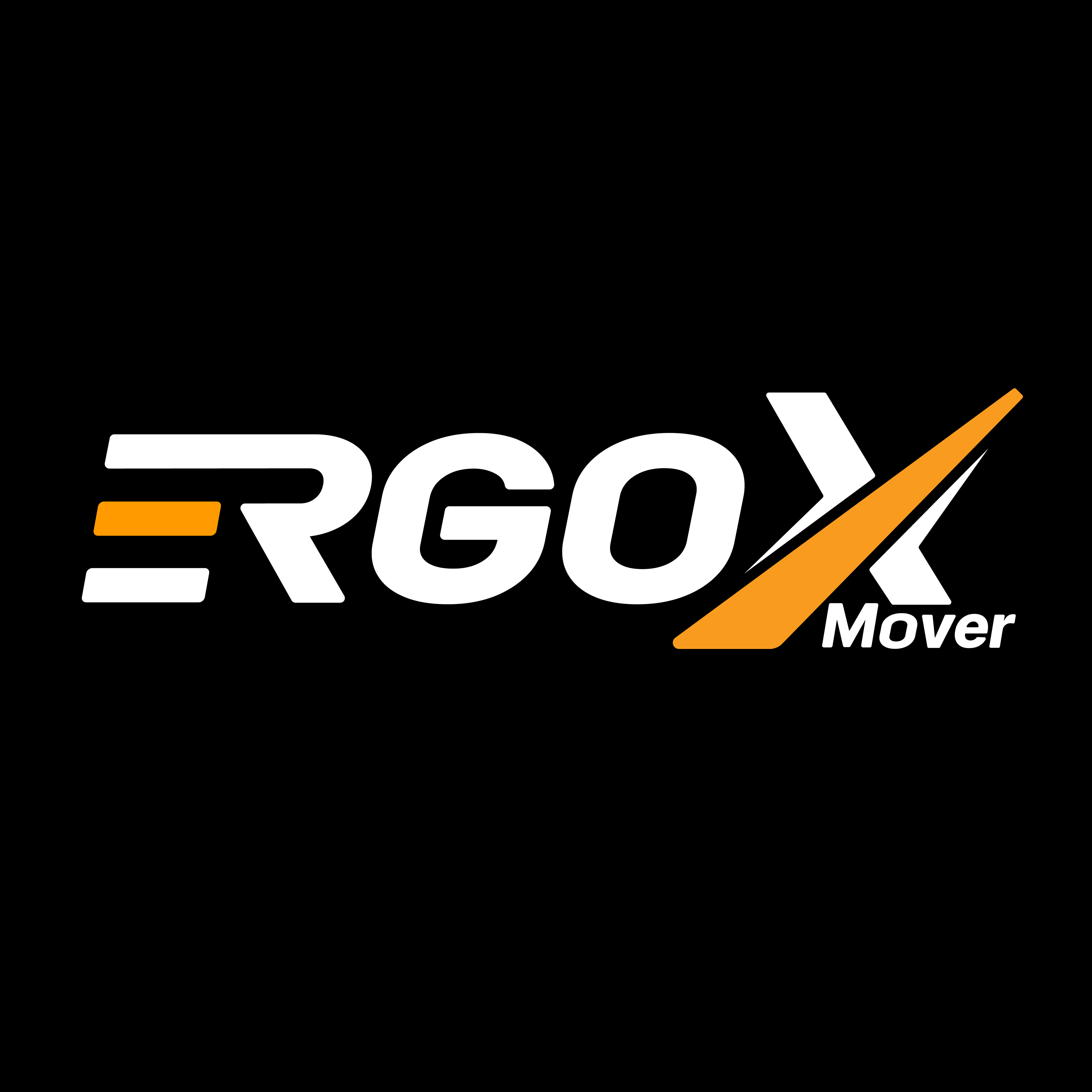
PRODUCT LOGO - ErgoXmover
This is the final result of the product logo. Scroll down to see the design process.

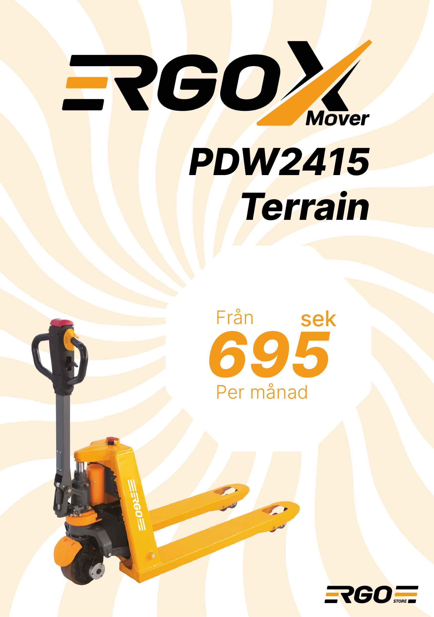
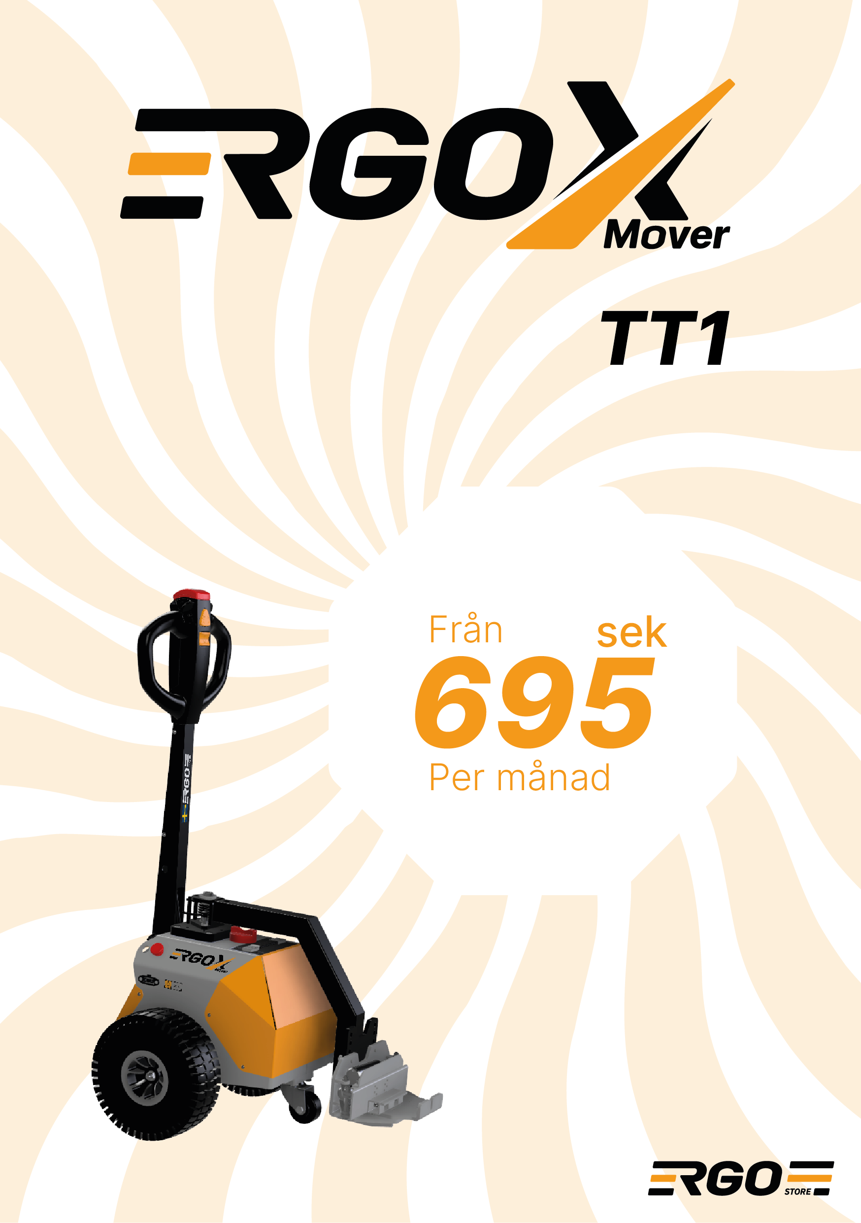
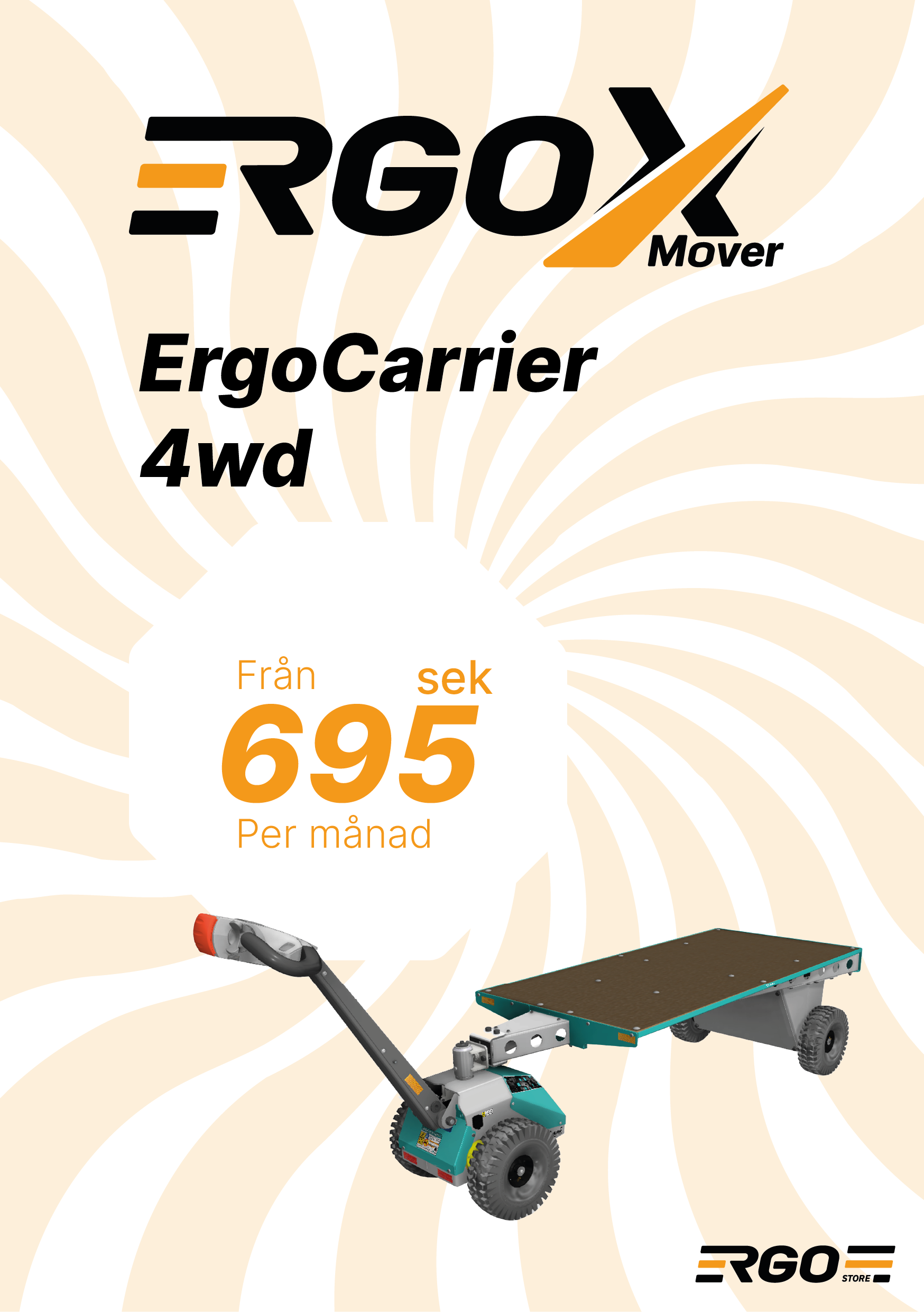
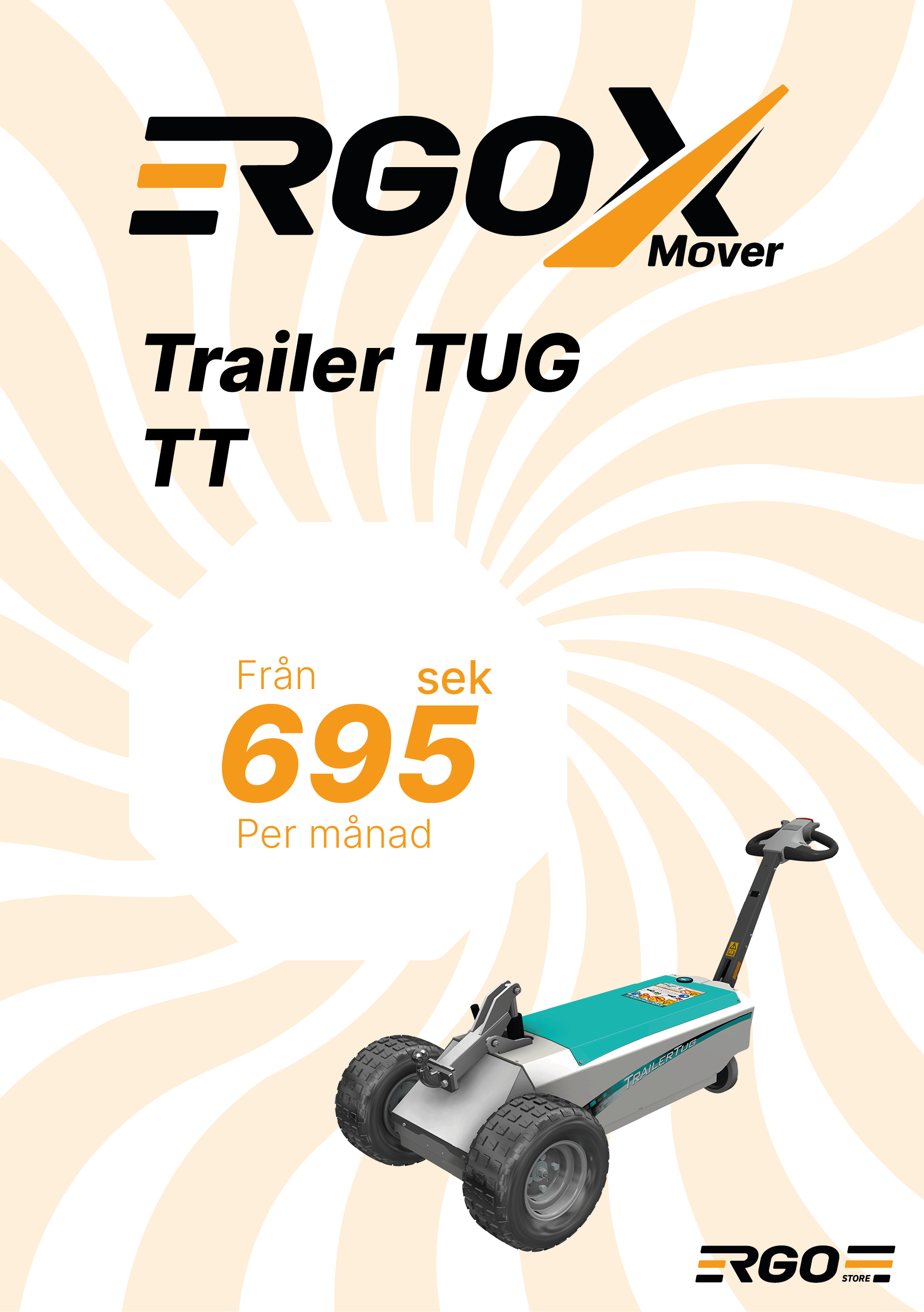
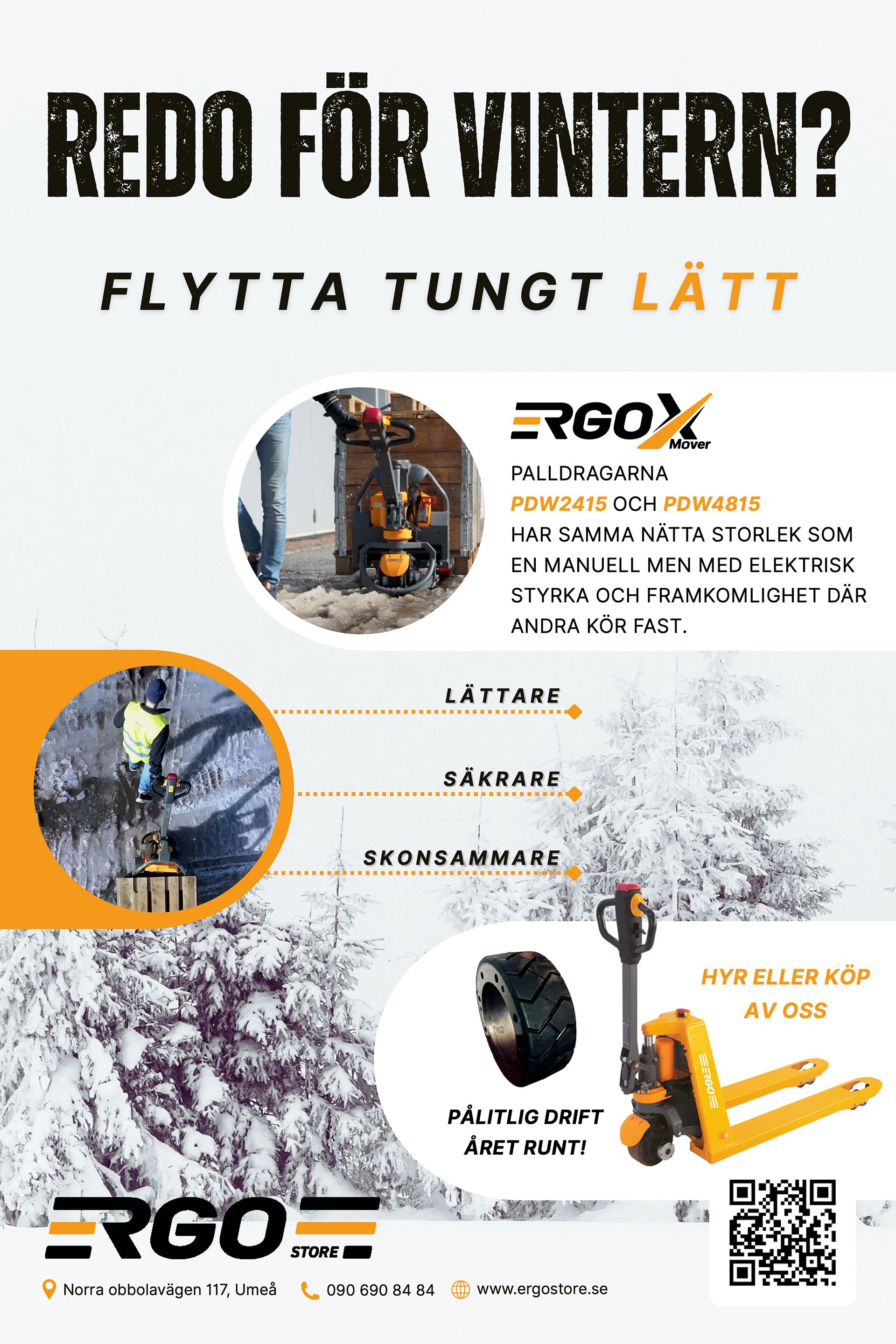
MARKETING AND PROMOTION MATERIAL
Promotional materials designed for Ergostore’s trade fair booth, ensuring a cohesive and professional visual identity.
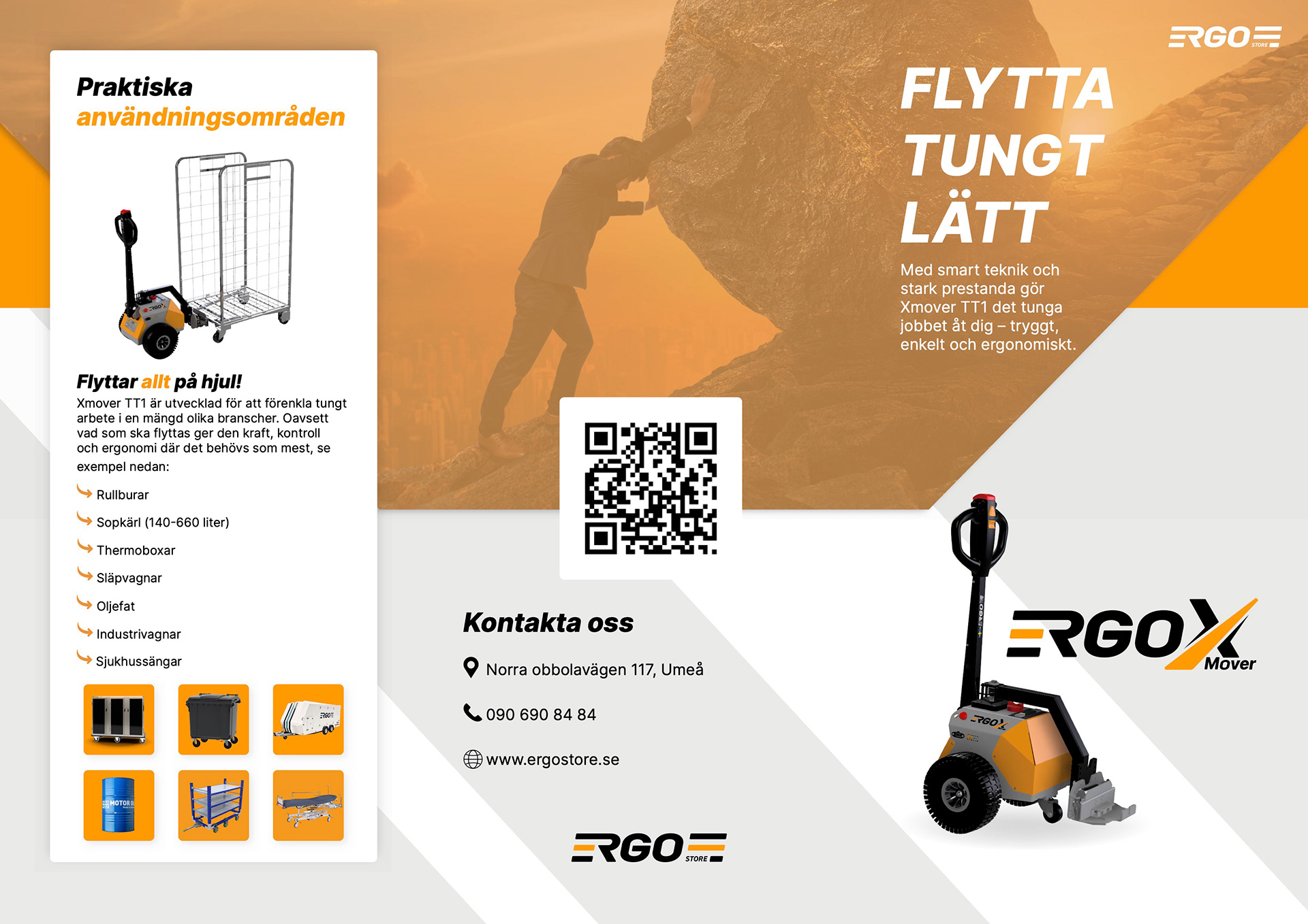
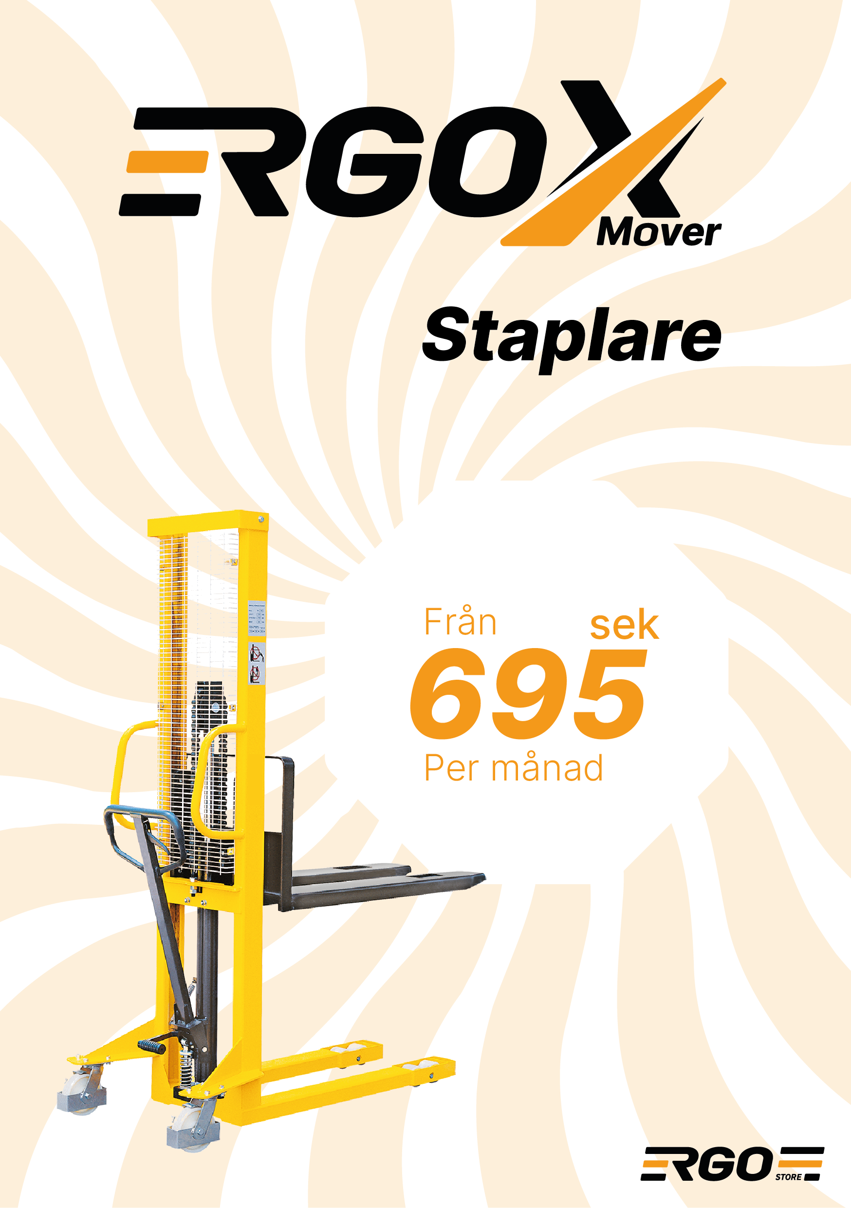
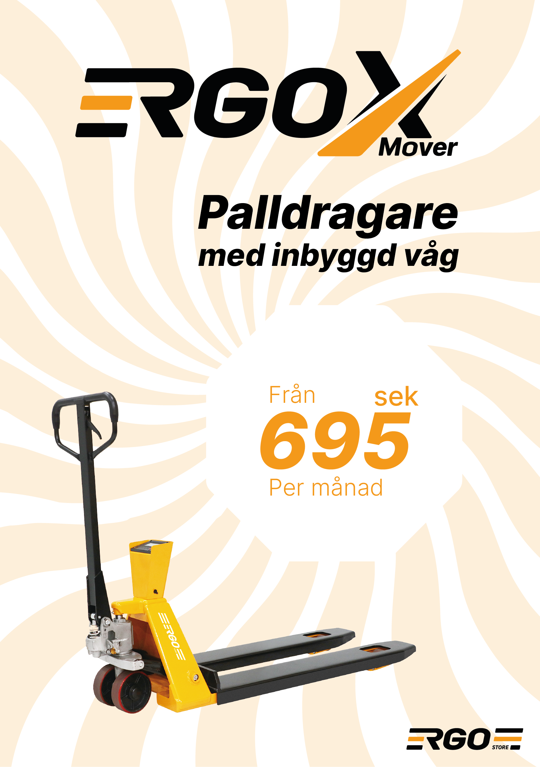
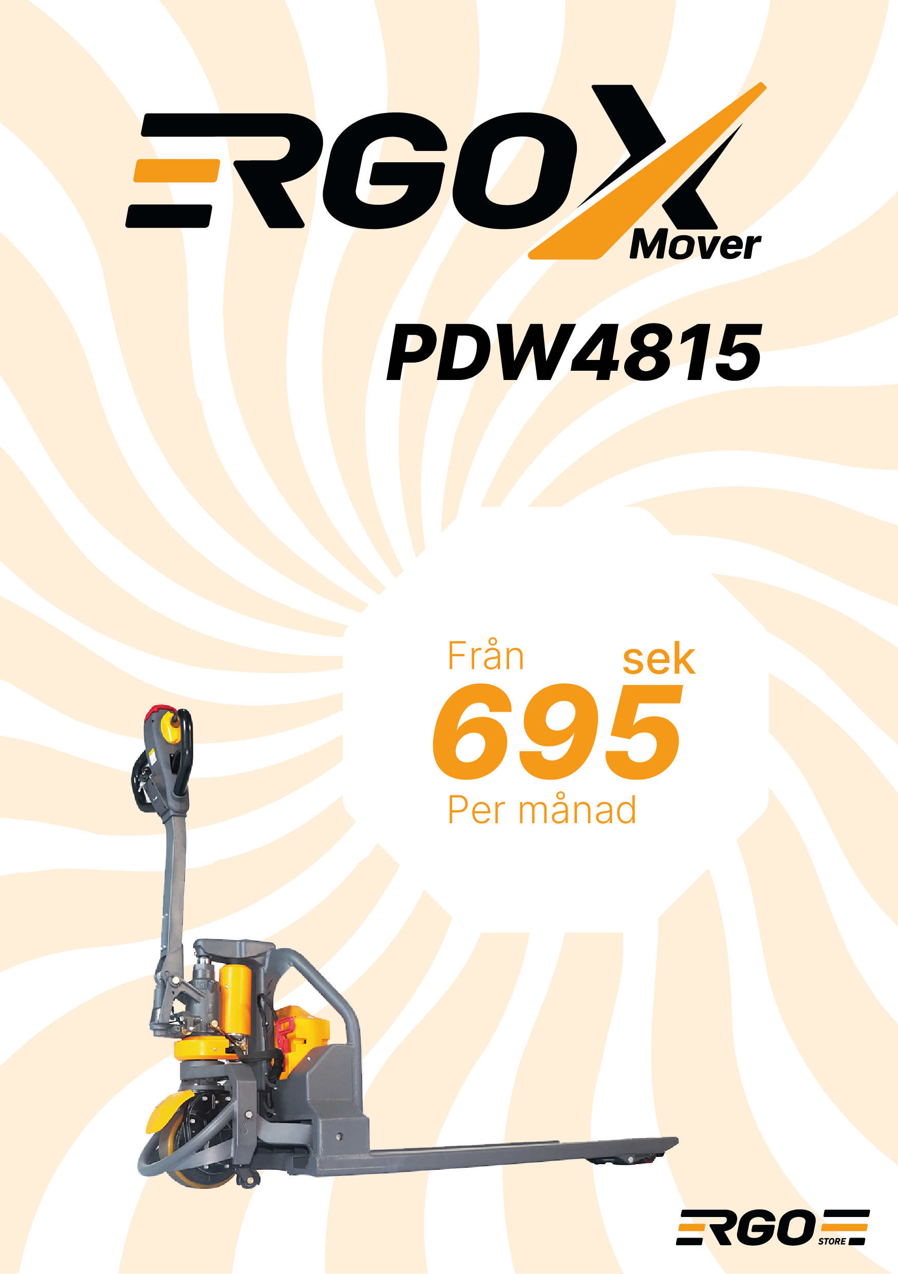
Product sheet – Front
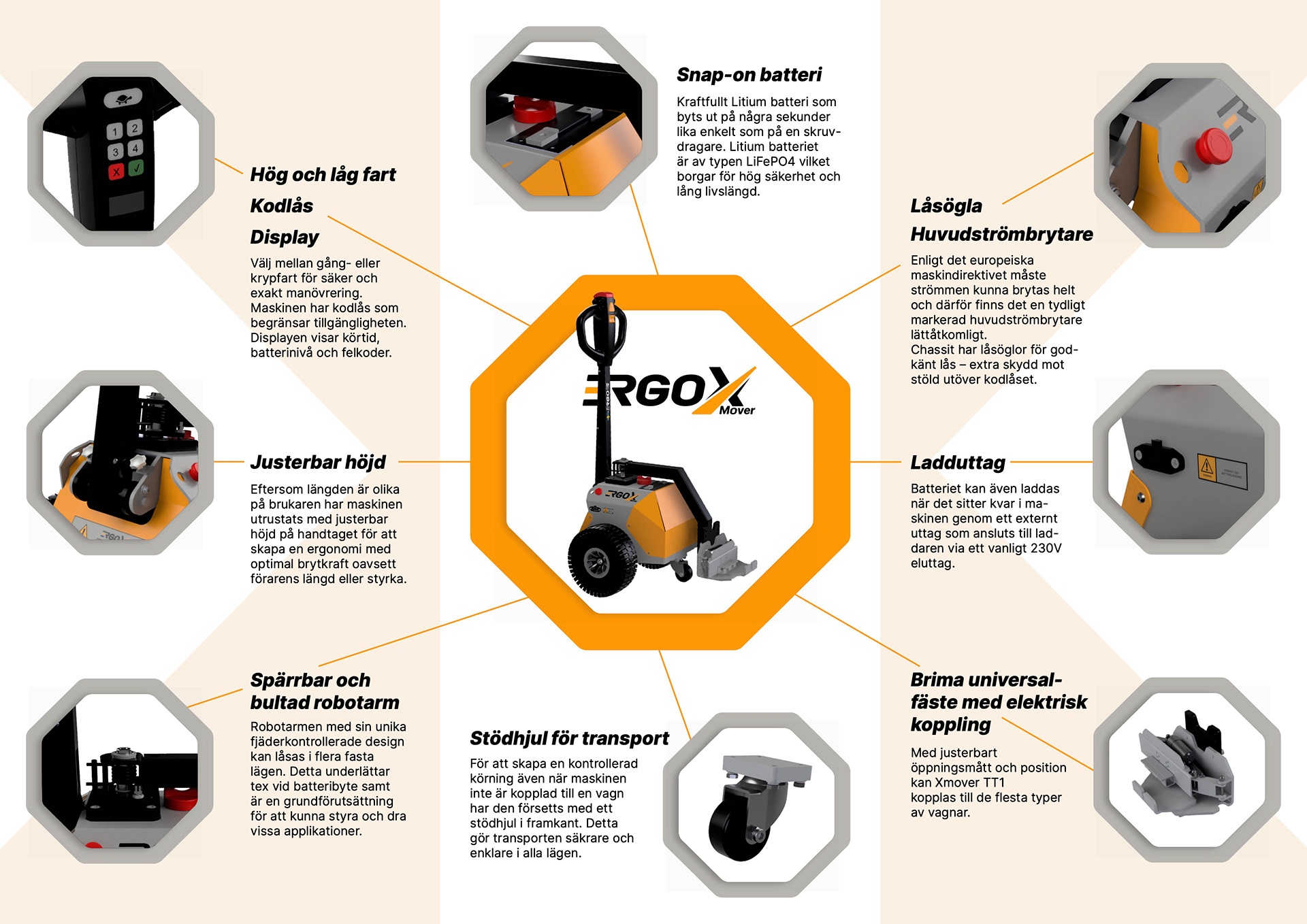
Product sheet – Back
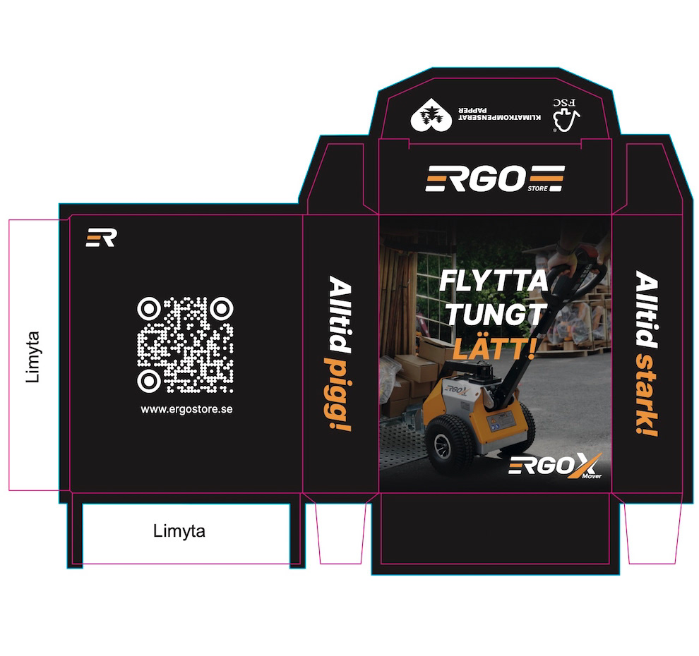
Candy Box for trade tair
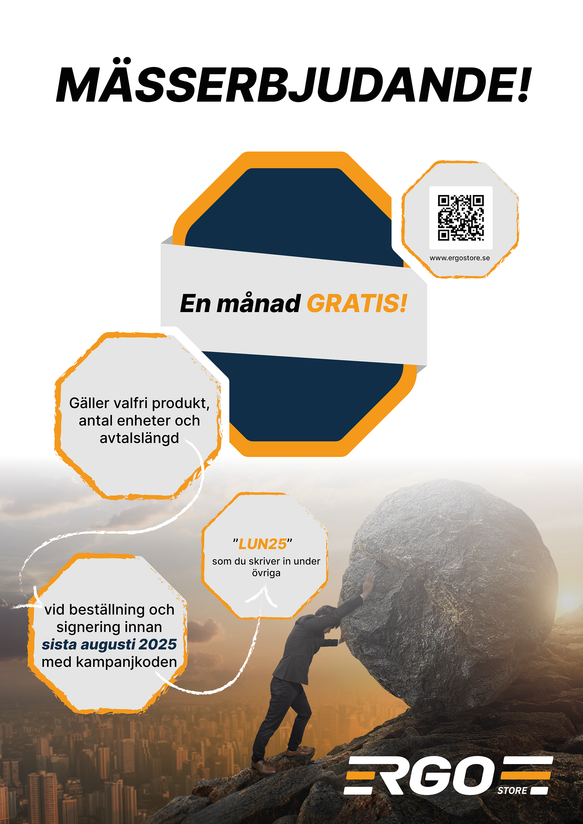
Trade fair offer sign
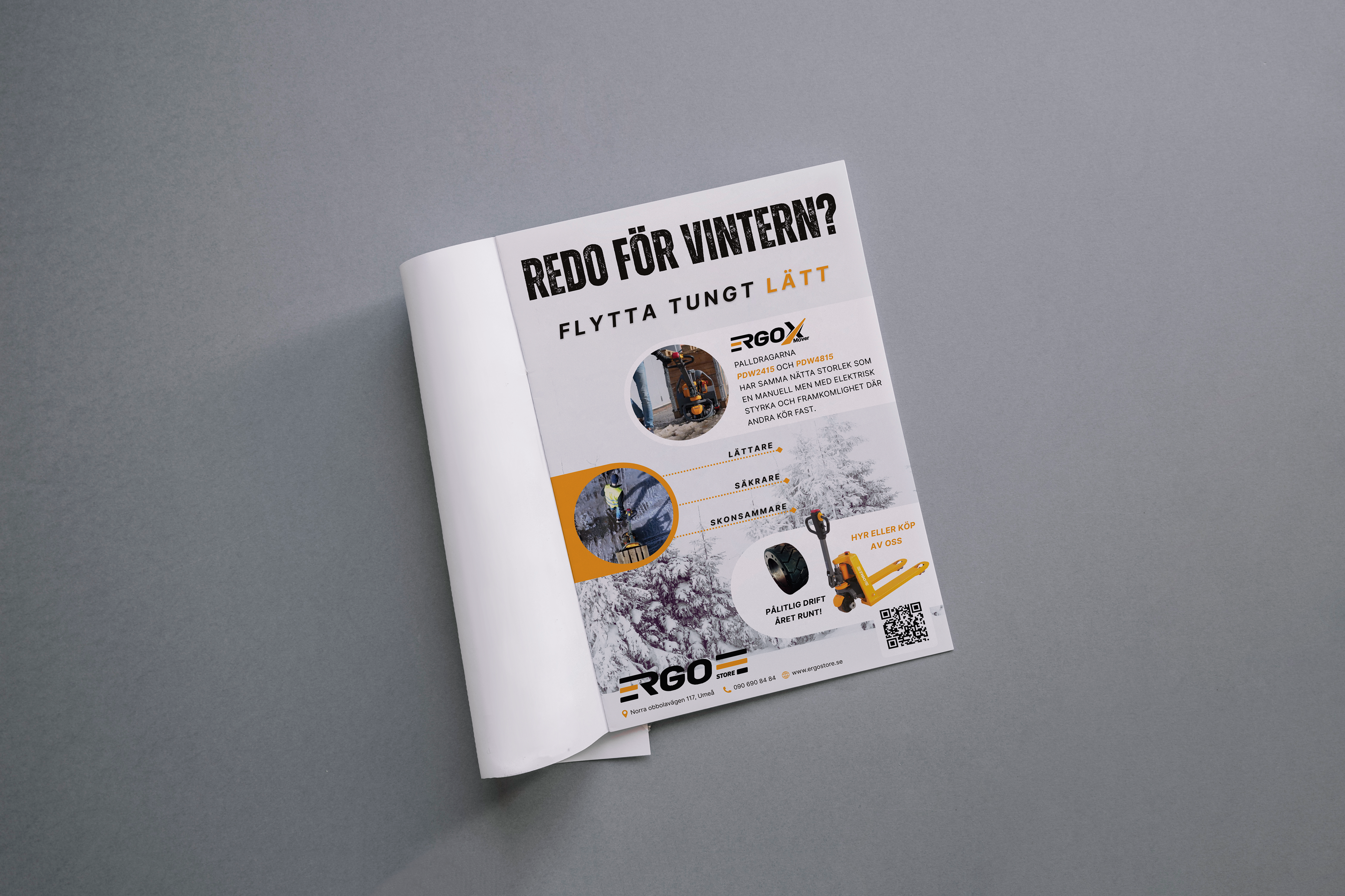
An advertisement in VK Affärsliv, September 2025
A compilation of several video clips combined into one. This was created for a trade fair and displayed on a screen in the background of the booth, which is why it has no sound. The production was made using After Effects, Illustrator and Premiere Pro.
A short clip showcasing a product. It was created for a trade fair and therefore has no sound.
LOGO DESIGN PROCESS
Brief
The goal was to design a logo for the Ergo X Mover product series. The client wanted the new logo to maintain a clear link to their existing “Ergo” logo, while giving the series its own distinct and recognizable identity.
The goal was to design a logo for the Ergo X Mover product series. The client wanted the new logo to maintain a clear link to their existing “Ergo” logo, while giving the series its own distinct and recognizable identity.
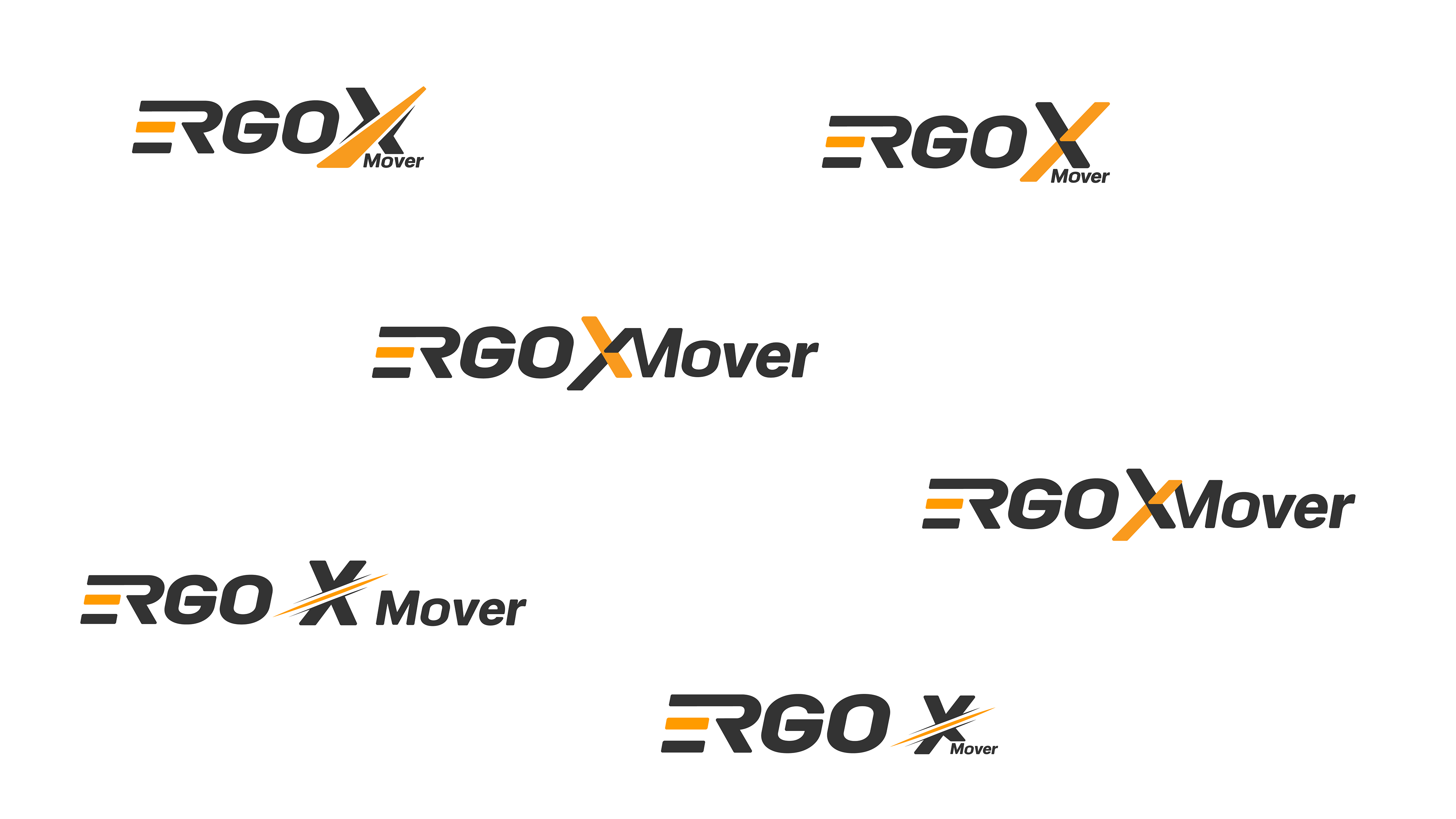
Exploration & Sketching
In the second step, I explored different directions through sketches and digital drafts. The focus was on finding a strong visual identity for the X Mover series, while keeping a clear link to the original Ergo logo. I experimented with typography, shapes, and the role of the X to capture movement and strength.
In the second step, I explored different directions through sketches and digital drafts. The focus was on finding a strong visual identity for the X Mover series, while keeping a clear link to the original Ergo logo. I experimented with typography, shapes, and the role of the X to capture movement and strength.
Concept Development
I developed several digital variations where the X was emphasized in different ways to symbolize strength, movement and innovation. I explored how the X could stand out while still keeping a clear connection to the original Ergo logo.
I developed several digital variations where the X was emphasized in different ways to symbolize strength, movement and innovation. I explored how the X could stand out while still keeping a clear connection to the original Ergo logo.
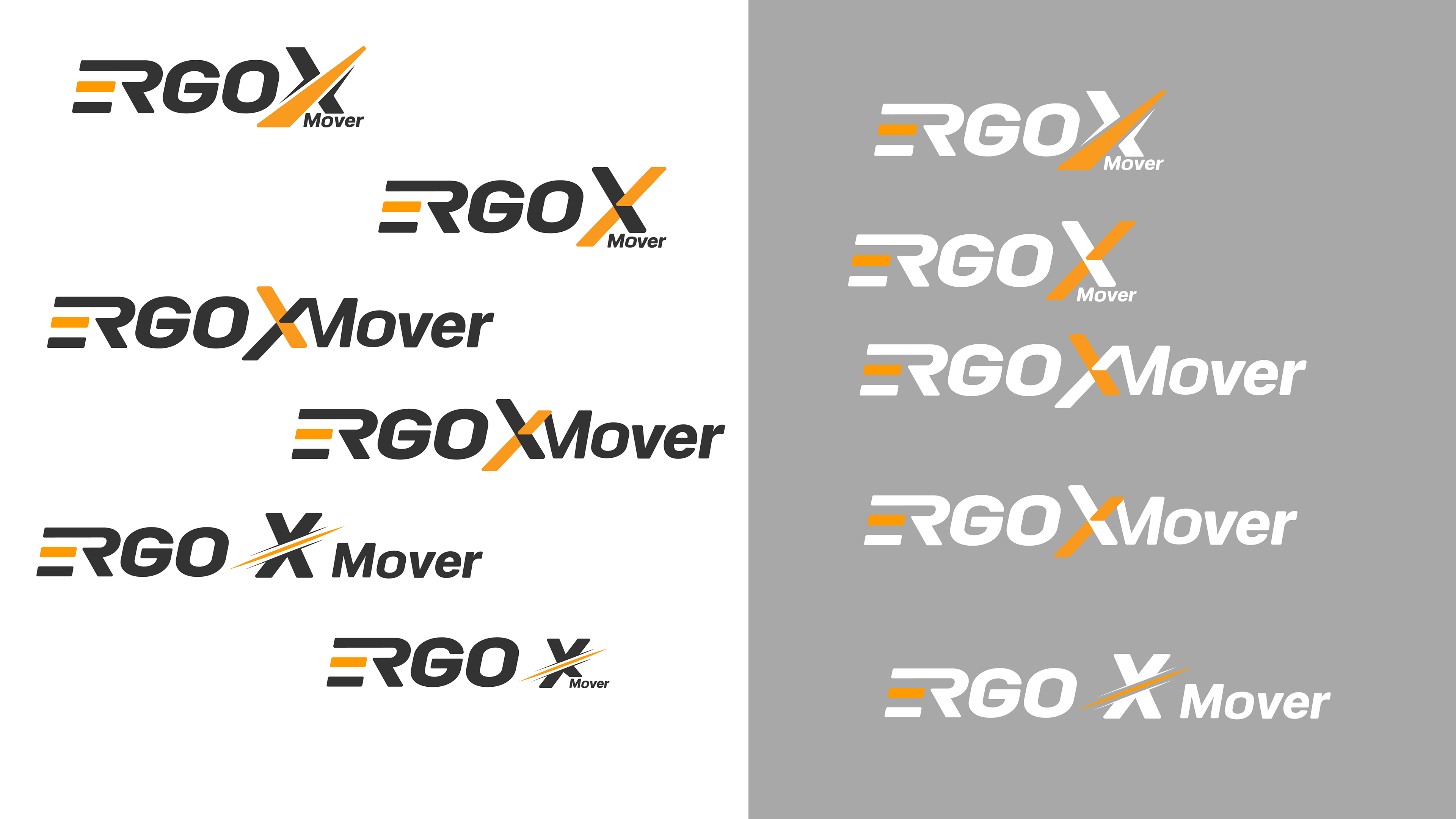
Refinement
Based on client feedback, I refined the chosen design, adjusting typography, proportions and details to ensure clarity and versatility. The final logo works in both small and large formats and maintains consistency across different applications.
Based on client feedback, I refined the chosen design, adjusting typography, proportions and details to ensure clarity and versatility. The final logo works in both small and large formats and maintains consistency across different applications.
Result
The finalized logo reflects the product’s functionality and Ergostore’s brand values, providing a strong visual foundation for their new electric tug series.
The finalized logo reflects the product’s functionality and Ergostore’s brand values, providing a strong visual foundation for their new electric tug series.